Refmetrix (Initial Concept)
Project Brief
Roles
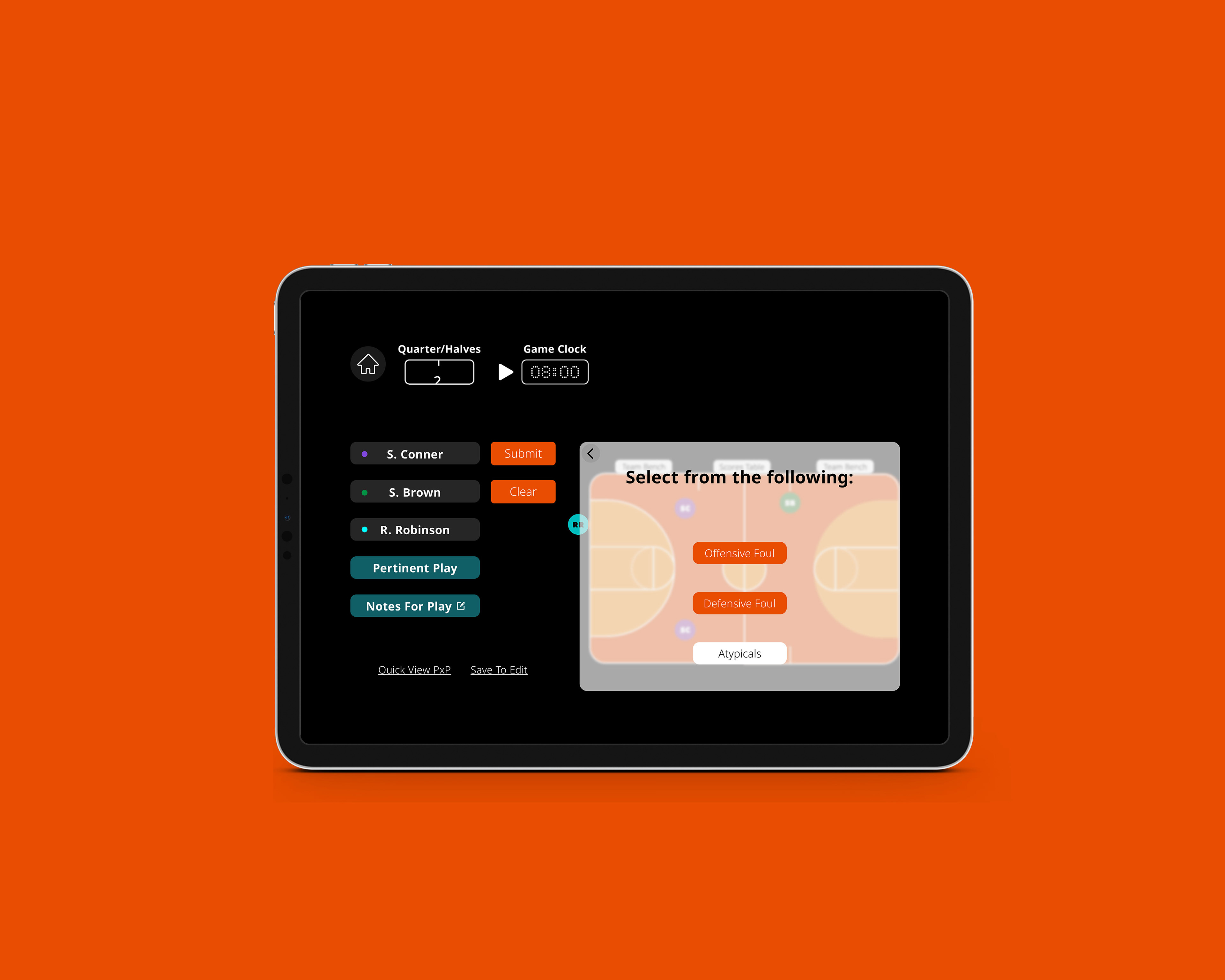
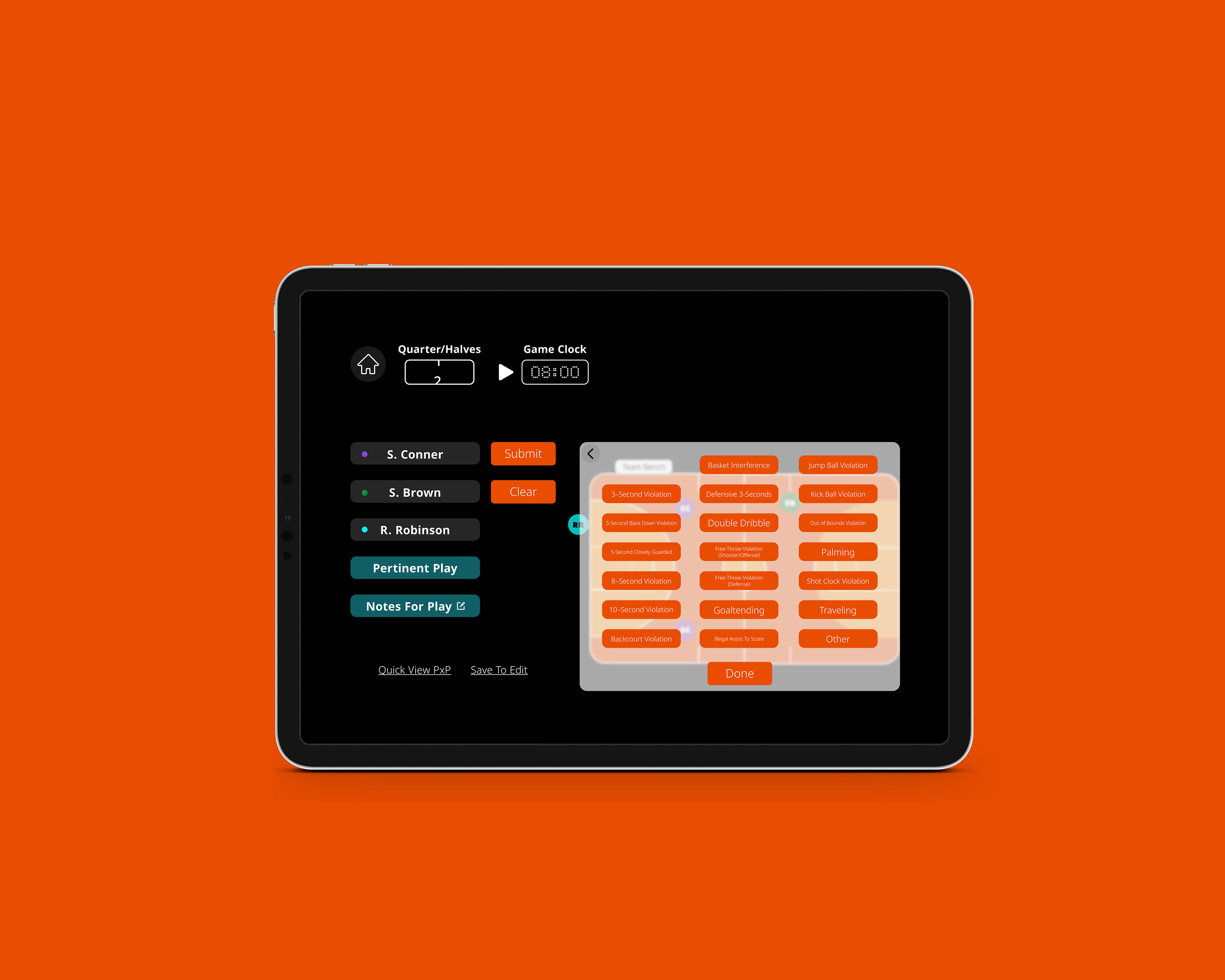
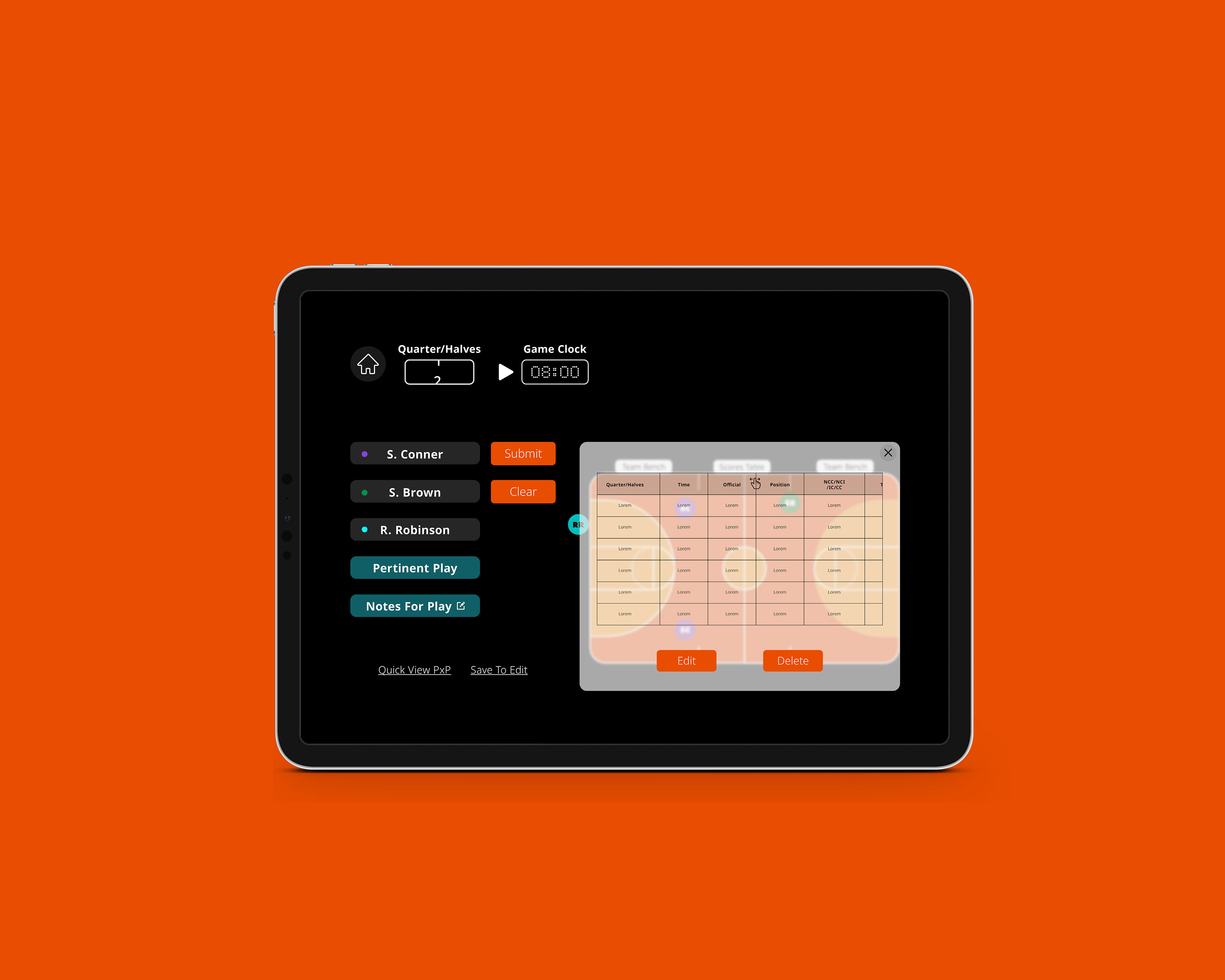
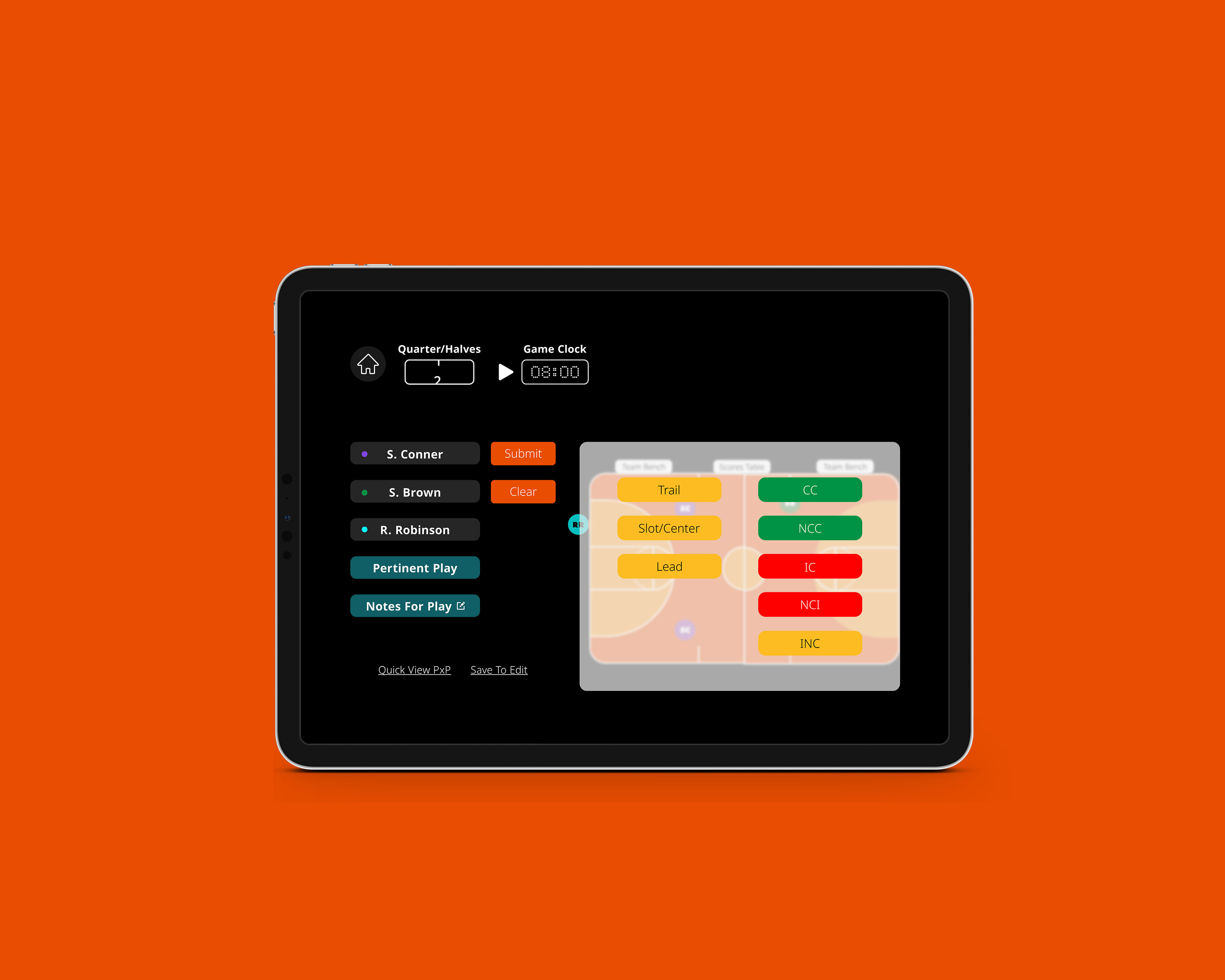
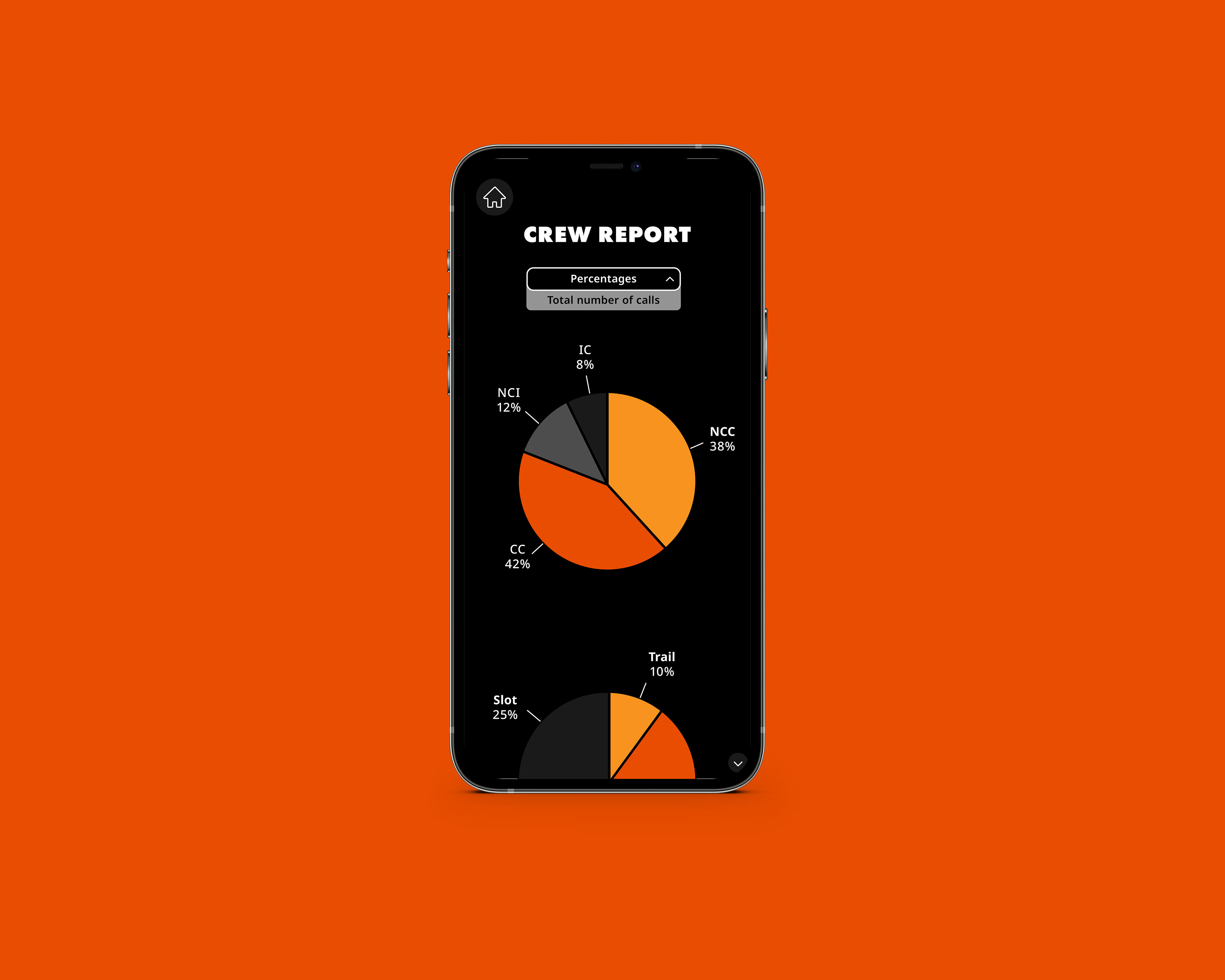
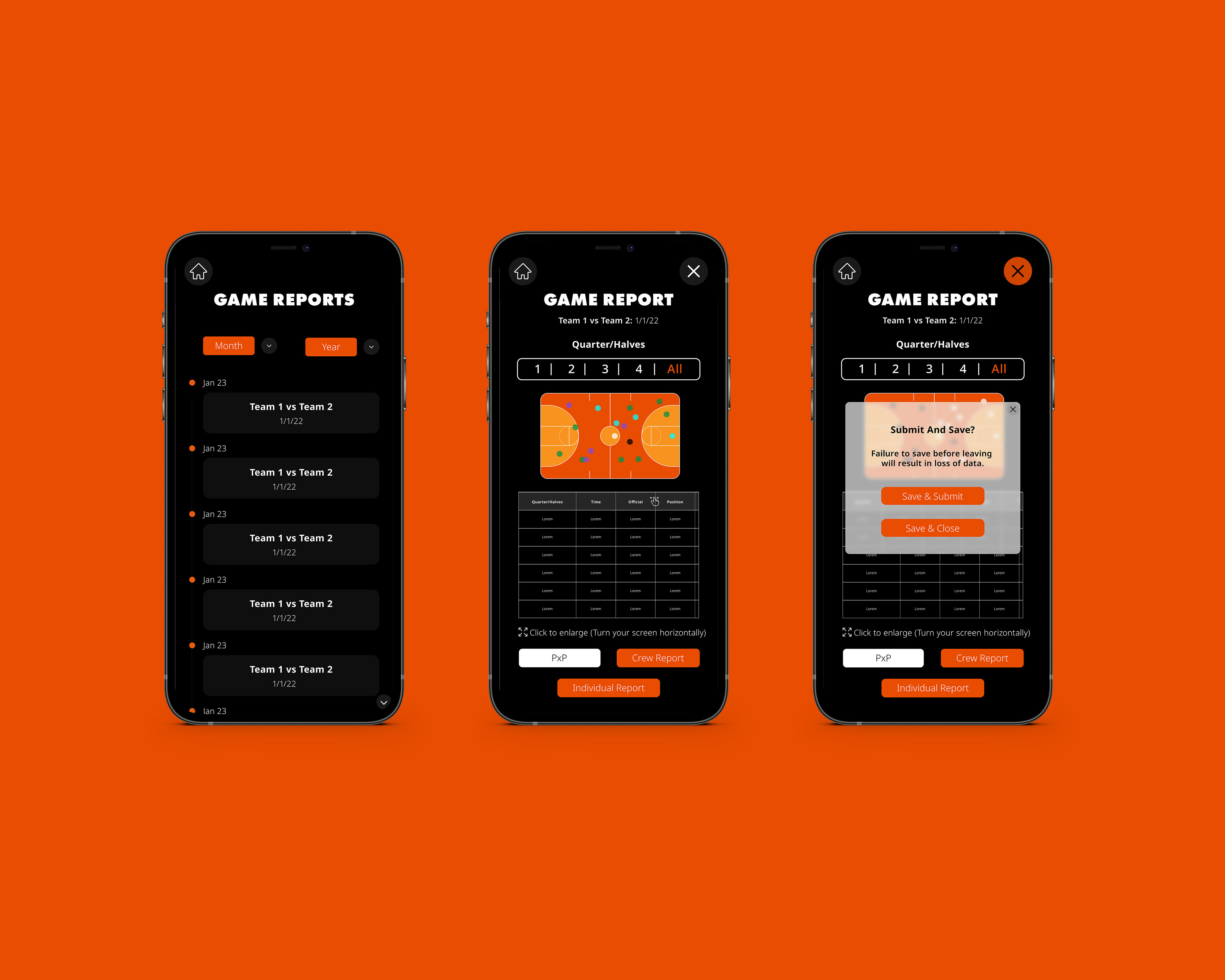
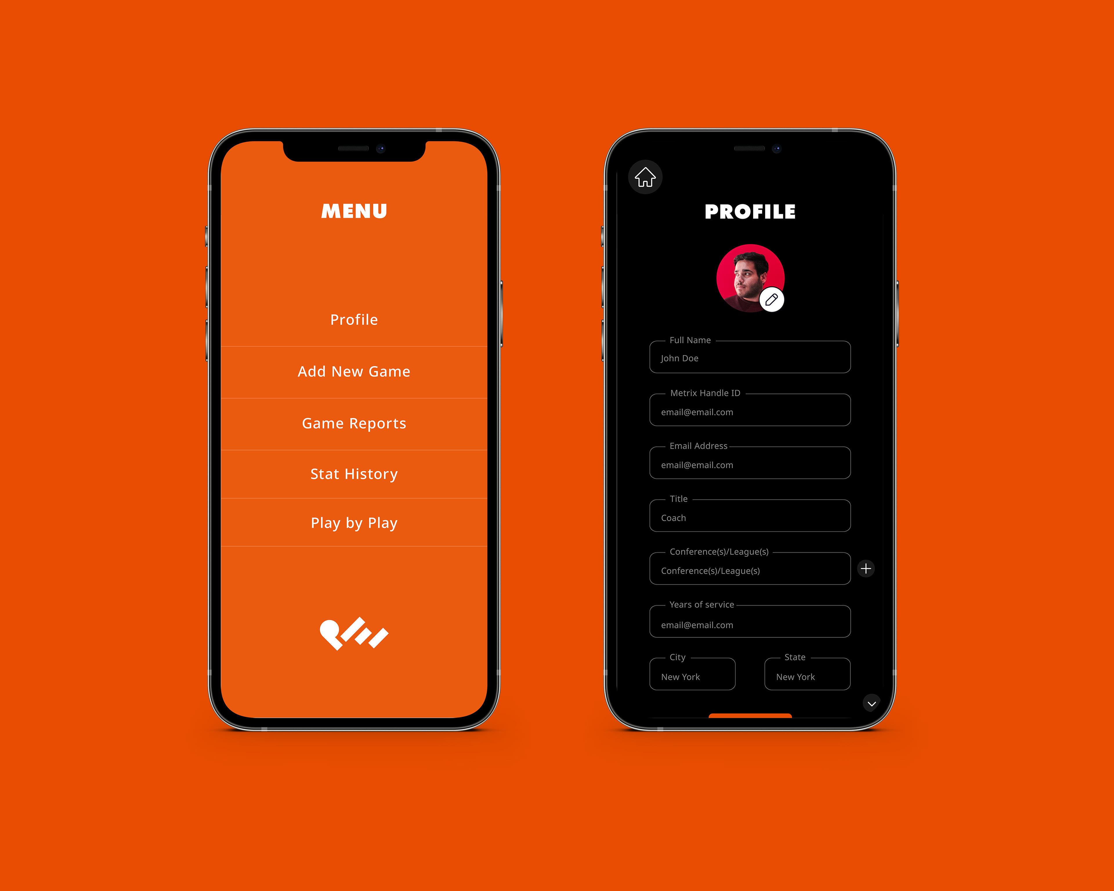
Tasked with creating the user interface of an app designed to make users able to keep track of a game's fouls, points, etc. The client also requested a logo to be the face of the brand. This was the initial concept drafted for the app and was later altered as it developed further.
Creative Director: Cimone Key
Logo, User Interface Design, Graphics, Typography:
Koré Siller Ramos
Koré Siller Ramos
Solution
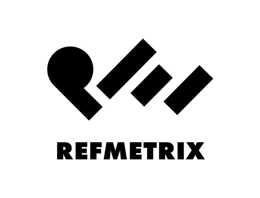
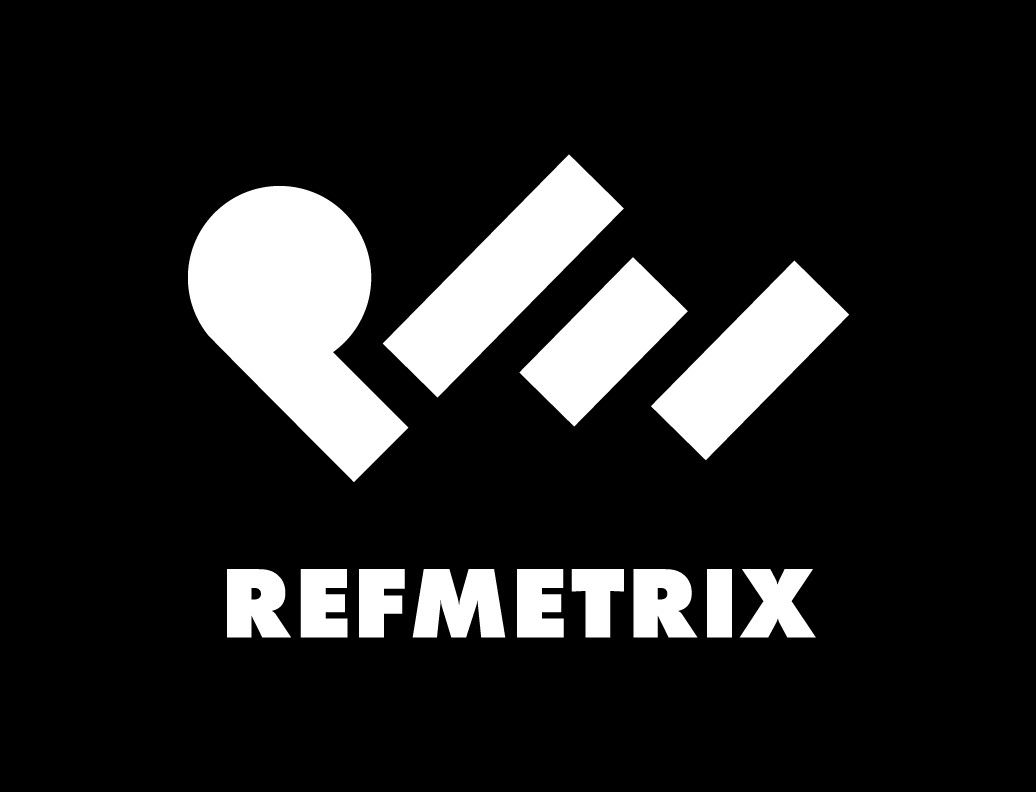
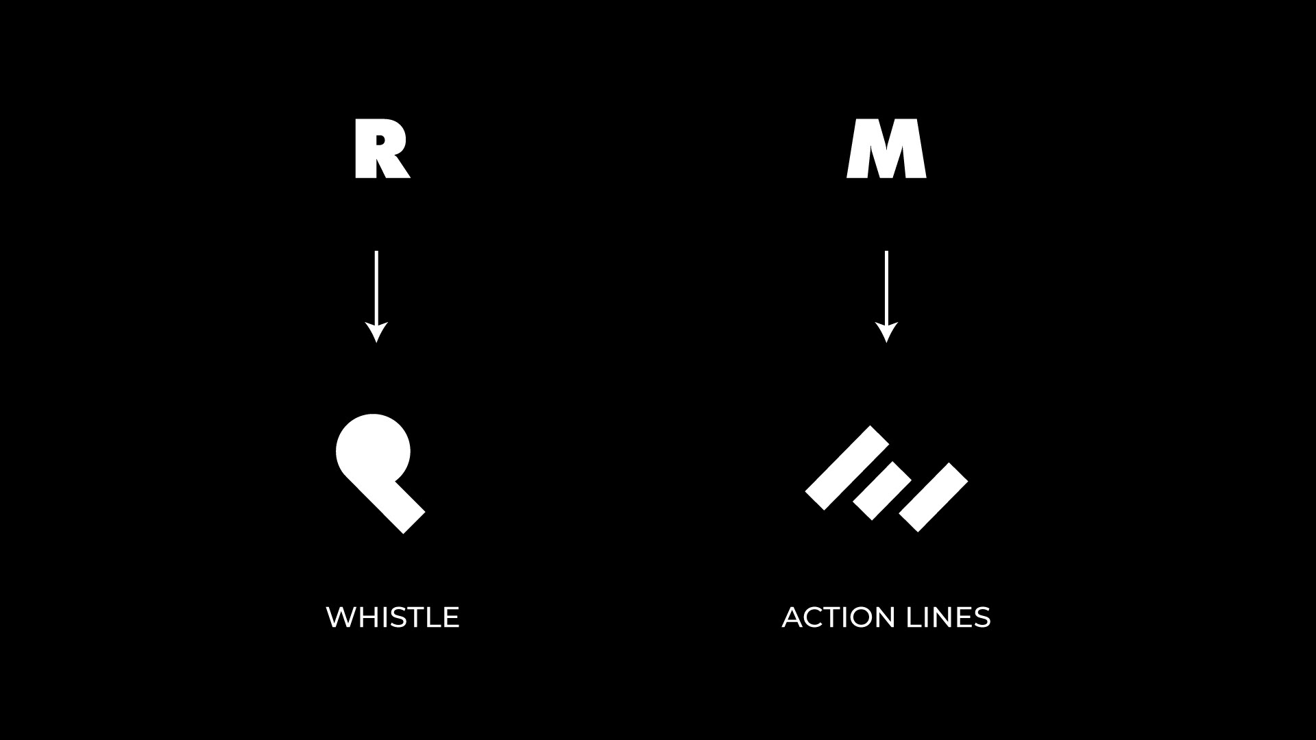
For the logo, the client wanted something modern, clean, and simple. In order to reflect the identity of the app and brand, we went with something a little more abstract. The R became a whistle, representing the main users of the app (referees and coaches). The M became three diagonal lines that represent movement and action (keeping up with the game). A bold and geometric typeface brought in some visual weight while still feeling sporty and sophisticated.
For the app, we continued that modern feeling with a UI that is simple and direct but added bold colors to make it feel alive. Orange is the dominant accent color, which is a high-energy color that is commonly used in sports. The choice to have a primarily black background app was to provide high contrast and give the aesthetic a bit of an edge.
Logo
Mobile

IPad