Lokum App (Initial Concept)
Project Brief
Roles
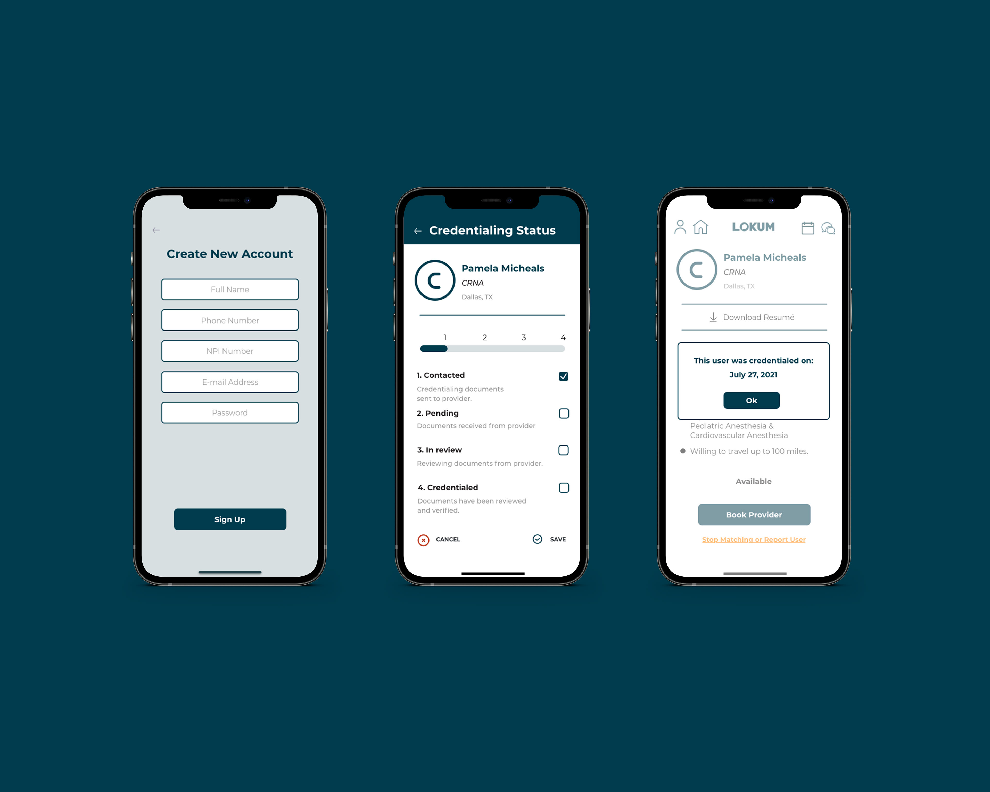
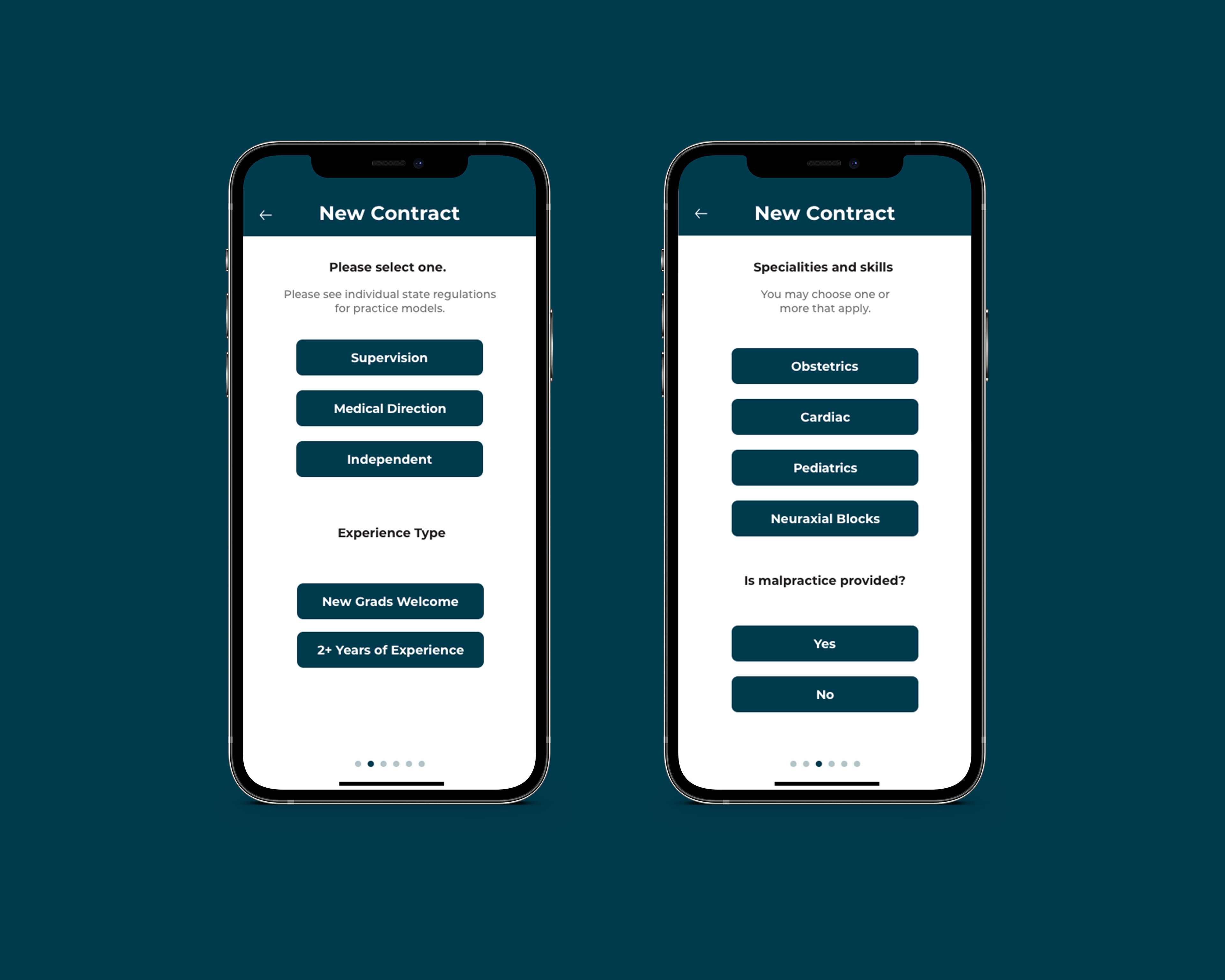
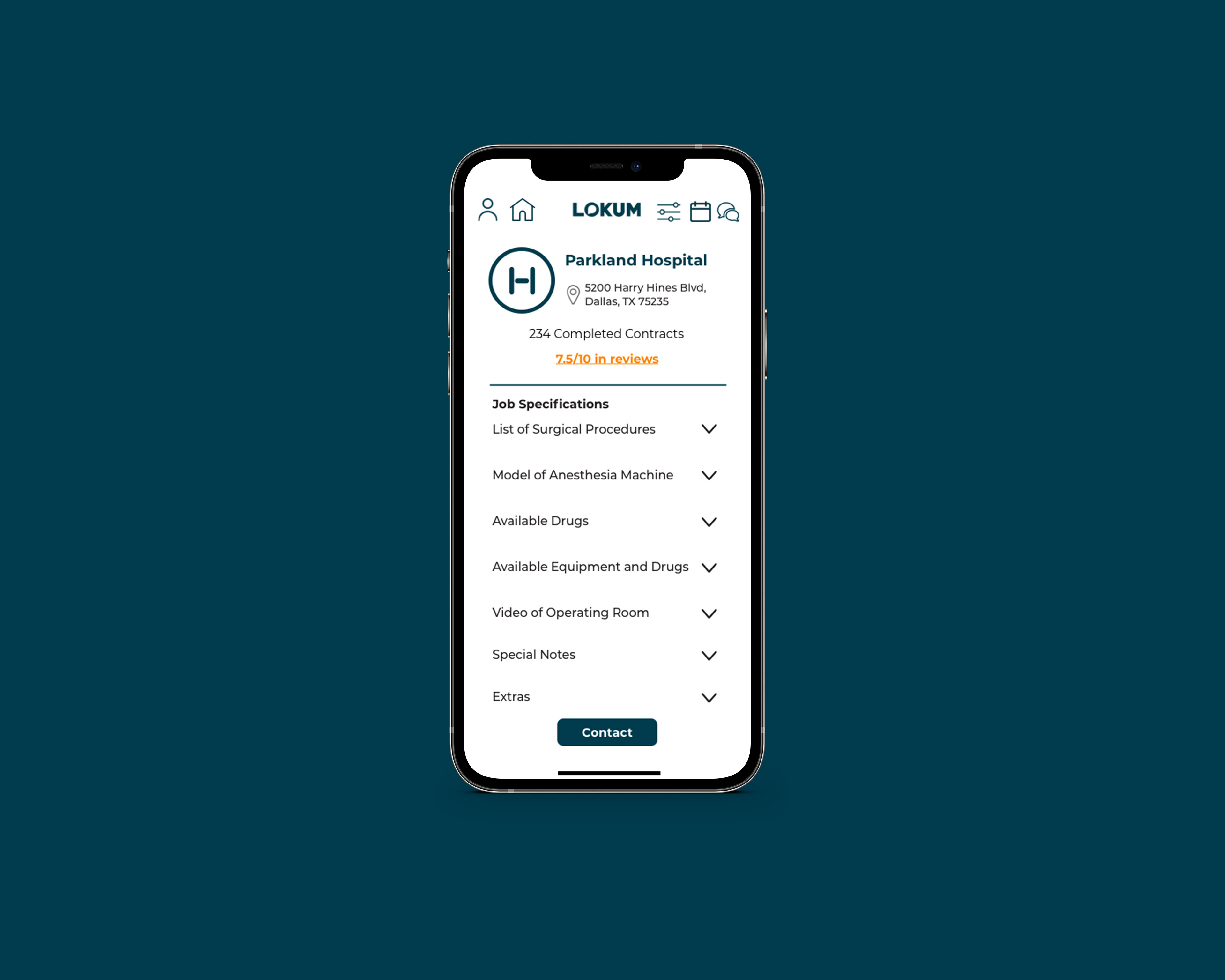
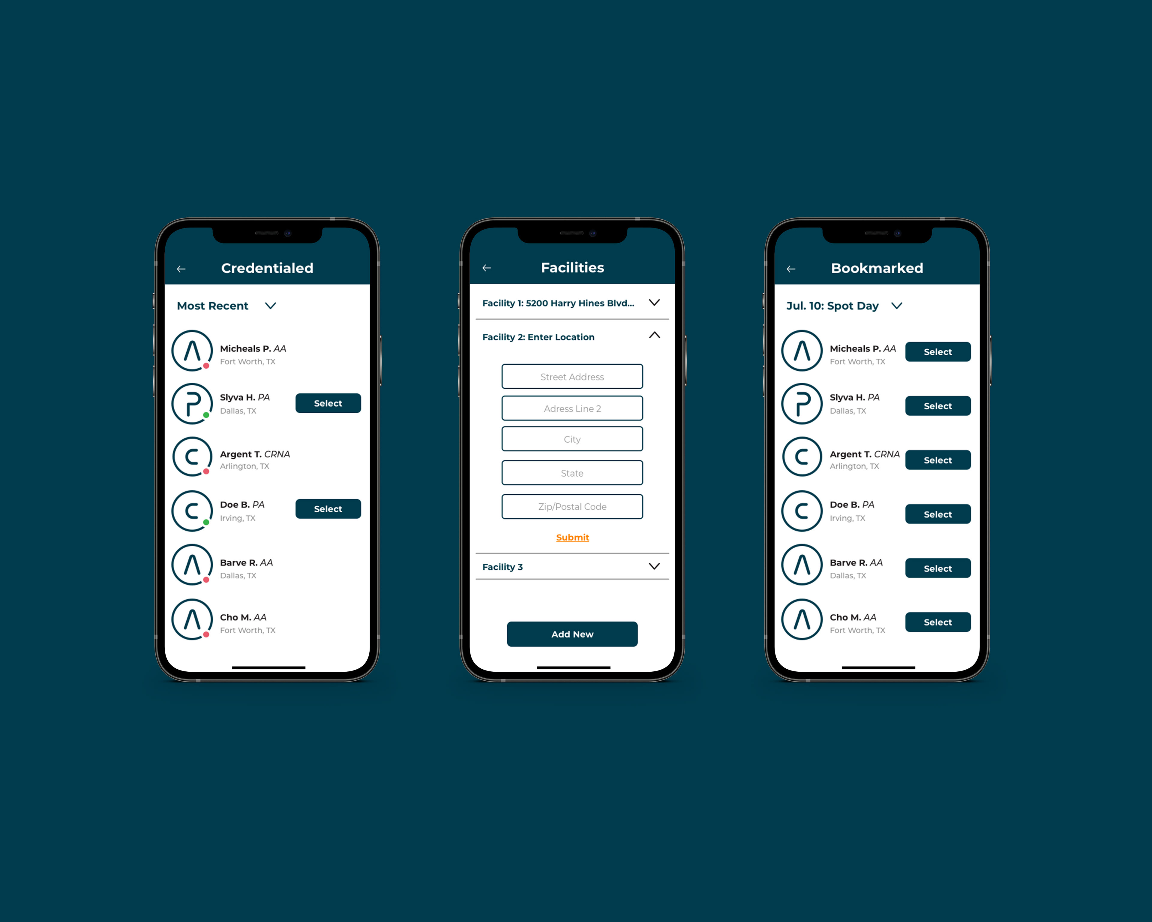
Tasked with creating the user interface of an app designed to make staffing in the anesthesia community less complicated. Unfortunately, the client decided to move forward with a different design, however, this project showcases my own ability in UI/UX and how I tackle complex problems.
Creative Director: Cimone Key
User Interface Design, Graphics, Typography: Koré Siller Ramos
Solution
In order to reduce visual clutter and make the staffing process feel simpler than it was, we took a direct approach that felt practical and in line with the aesthetic of the healthcare industry. Still, keeping in line with the Client's request for something more modern, the UI of the app features two colors with high enough contrast for readability and accessibility (white and blue), a sans serif typeface that is easy to read, and a layout that avoids flashy graphics and optimizes negative space.
Mobile


